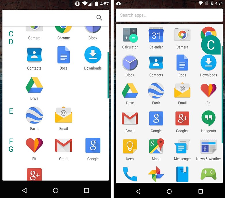
Change the White Background in Android M 6.0

I don’t know about you, but I must admit that I generally love the new features of every single new Android OS version. However, there are also exceptions and the lack of that amazing Dark Theme in Android 6.0 Marshmallow is one of them, not to mention that I really hate being confused because I got used to it.
I think that a dark theme that is expanded to the notification shade is extremely useful when using my phone at night, for sending an urgent message or for some night browsing before going to bed, so this white background is far from what I have in mind.
However, the good part is that this is a solvable problem. After getting latest Android update, many users complained about the very same thing. I know that I am not the only one, so if you are also one of those willing to find a way to remove or get rid from that white background and turn it in to semitransparent or even completely transparent, this simple guide will help you.
Yes, I know that this isn’t a change to the old black, but stock Android users will have to deal with the situation. It’s this compromise or nothing!
Remove White Background in Android M 6.0:
- For the start, go to the Google Play Store Nova Launcher; use this link for that;
- Take it and install it right away;
- After that, you can switch to a different launcher when you tap the home button and then tap Always;
- Go into Nova Settings;
- From there, you have to tap App & widget drawers;
- At the end, just tap the slider to turn Card background off;
- Now, forget all about that boring White background in the app drawer.
I hope that you’ve enjoyed the guide and as a curiosity, were you also hoping that dark theme would make it into Android 6.0? Were you also confused about the fact that this changed without your prior knowledge? Let me know your thoughts in the comments.
Speaking of the most recent Android OS versions, more tutorials are waiting for you:
- Restore Pixel C to Stock Android 6.0.1 Marshmallow;
- Learn how to Root Google Nexus 6P on Android 6.0.1 MMB29M Marshmallow OS with the help of this procedure;
- Flash Android 6.0.1 Factory Image on Google Nexus 7 LTE;
- You can also Flash Factory Image for Android 6.0.1 Update on Nexus 9 LTE with the help of this guide;
- Flash Android 6.0.1 Marshmallow Update on Google Nexus 9 LTE;
- You can also Root Google Nexus 5 on MMB29K Android 6.0.1 Marshmallow by using these steps;
- Flash Official Android 6.0.1 Marshmallow Factory Image on Google Nexus 5.


User forum
3 messages