New Facebook Layout 2013 Rolling Out In Mass

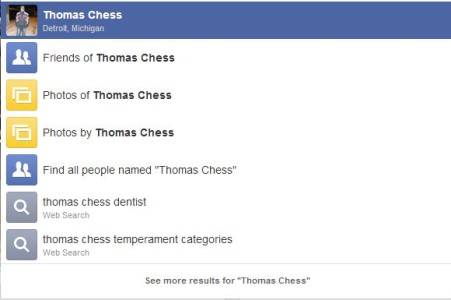
So, here we are again, Facebook started rolling out their new layout for the social network and the first impression is that they have done some good things about it. The first big thing which has changed is the search bar which is huge, both by height and wide, and the results are easier to follow. They have also moved the “Friend Request”, messages and Notifications on the right side, which for me is a good thing as it turns my attention away from the upper left side of the screen directly on the right side where I have the chat list, creating a more pleasing way to follow all the messages and notifications among useful information like who’s online.
Now going back to search results, they are definitely better than what we previously experienced, but it leaves me with the feeling that it was designed for people with bad eye sight, who are quite unable to see and follow small text or pictures. At least we are now confident that everybody is going to see what they are looking for, including things they are not so willing to look at, but this is Facebook, either you “Like” it or move to Google+, which in my opinion is a better social platform, but it is not used as it would deserve.
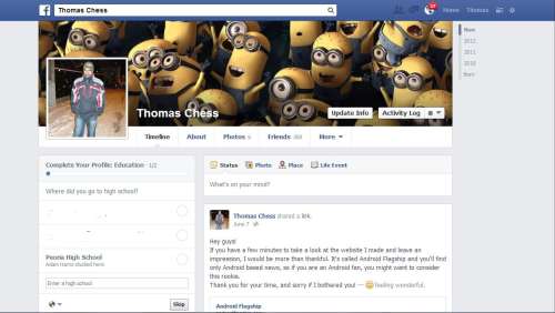
Among search results, we also have the browse button which does almost the same thing but on a larger scale as search does. The last thing I have noticed is the Facebook button, placed in the upper left side of the screen which is now replaced with the Facebook logo, white background and classic blue “f” filled letter, giving it a more futuristic view.
In the end, any change is meant to make a good difference based on user experience, and after so many contested changes made by Facebook, this one seems to be an appreciated one, which stands for its name: ” Best Social Media Platform”. So, tell us, were you converted to the new layout and if you did, what was your first impression?


User forum
0 messages