Customize Samsung’s Galaxy Note 8 Home Screen Grid
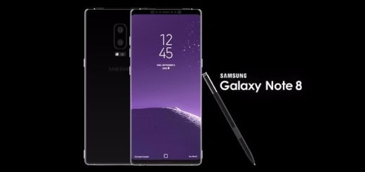
Samsung’s Note devices have big screens, and that means there is extra room for more apps on your home screen. Note 8’s vibrant 6.3-inch OLED screen, with that tall, slim design make everything to look like being possible all the time and last year’s disastrous Note 7 situation is nothing more than a part of the past now. Don’t you agree with me on that?
The default resolution is Full HD+ and can be easily changed to Quad HD+ (WQHD+) in Settings and give you vibrant colors, the near bezel-less, full-frontal glass, edge-to-edge screen comes in the form of an Infinity Display that looks better than ever before, yet sometimes changes are a must even on a handset that seems to have it all at this chapter.
Be sure that even more Galaxy Note 8 are waiitng for you, so learn: How to Stream Audio to 2 Devices with Bluetooth 5.0 or to Turn on Galaxy Note 8 Game Launcher
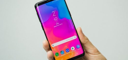
To be more precise, while older Galaxy Note phones had 5 apps across, it seems that the Samsung Note 8 went back to 4 app icons and not all of you love the change. The best part is that the home screen icon grid layout is customizable, so you can have more apps on your screen at once.
The main idea is that you can easily press and hold anywhere on the screen that doesn’t have an app icon. The display will simply zoom out into an edit mode where you can also choose to add a new wallpaper or try some fresh themes for a new look. Click on home screen settings and after that, feel free to choose either “home screen grid” or “Apps screen grid” to change how many apps can be on each row.
I can assure you of the fact that this works for the home screen and your application tray, so there is no reason to be angry.

